It’s no surprise that Cauldron Ice Cream’s “puffle” cones and beautiful frozen concoctions have gone viral on the internet multiple times. With bustling lines, a growing fanbase, and franchises opening left and right, the founders of Cauldron realized that their current branding, from brand identity to packaging to environment, needed a refresh. We happily became their creative partners—the only caveat was that first we’d get to enjoy their ice cream to our hearts’ (and bellies) content!
Client: Cauldron Ice Cream
Role: Designer
Studio: Chen Design Associates
Development: Hannah DeMoss
Environmental Design: Jackie Wade
Creative Services:
Competitive Research
Brand Identity
Art Direction
Packaging Design
Print Collateral
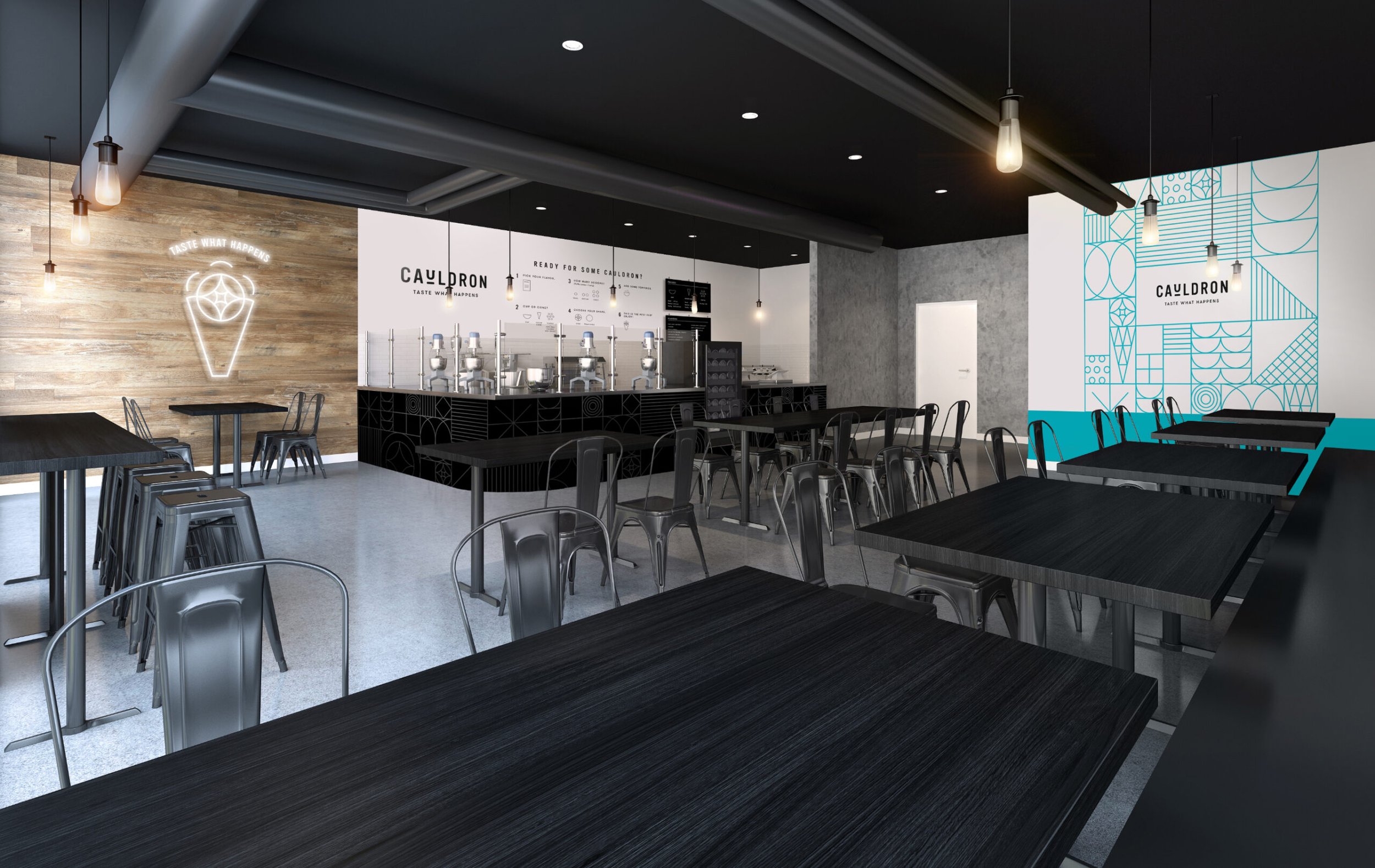
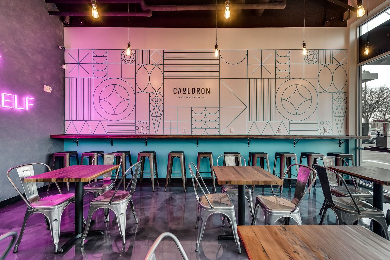
Environmental Design
Photo Credits: Cauldron
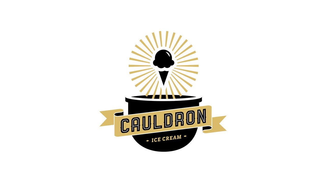
Old Logo
New Logo
A modern and clean font customized to include subtle rounded corners paired with a deep blue helped convey expertise and sophistication with a forward-thinking approach. The brand mark was created to resemble waves found along both California and Mediterranean coast. Within the waves we integrated the letters “w” and “l” as a nod to the founder’s first initials.


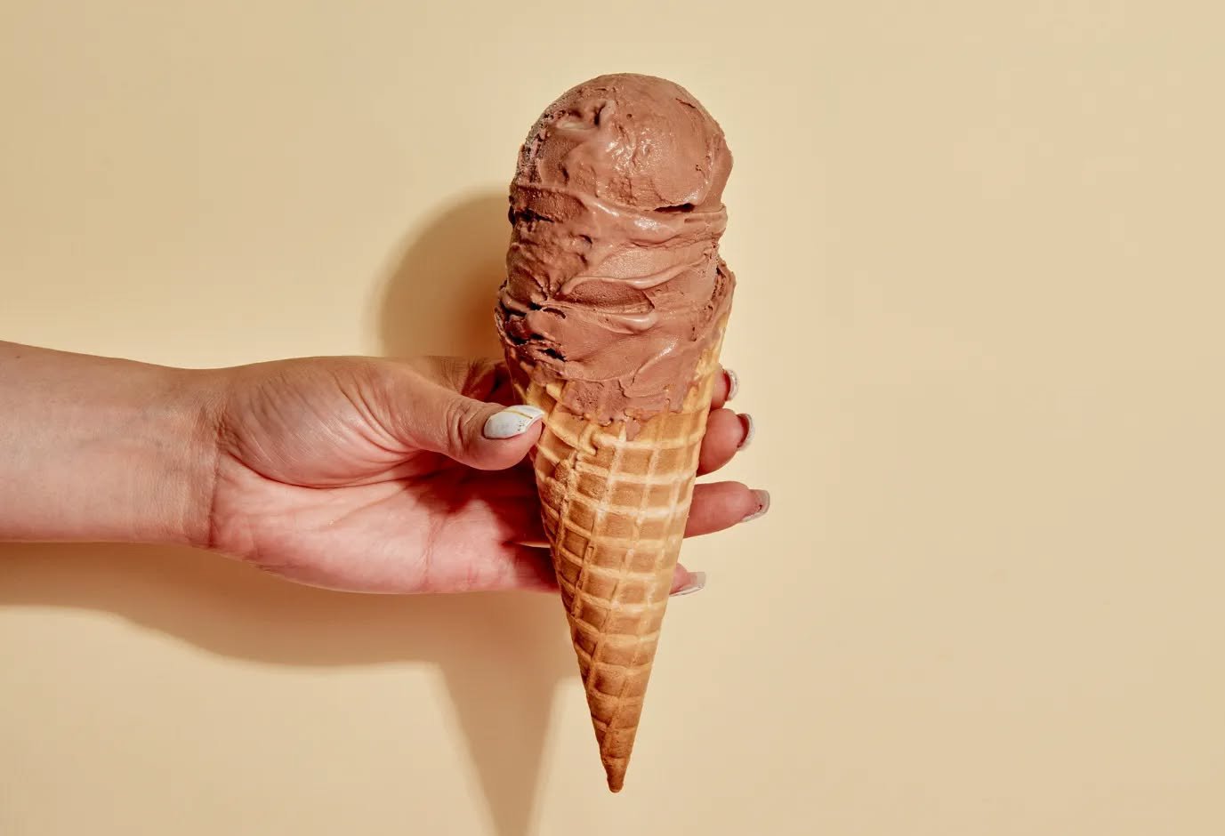
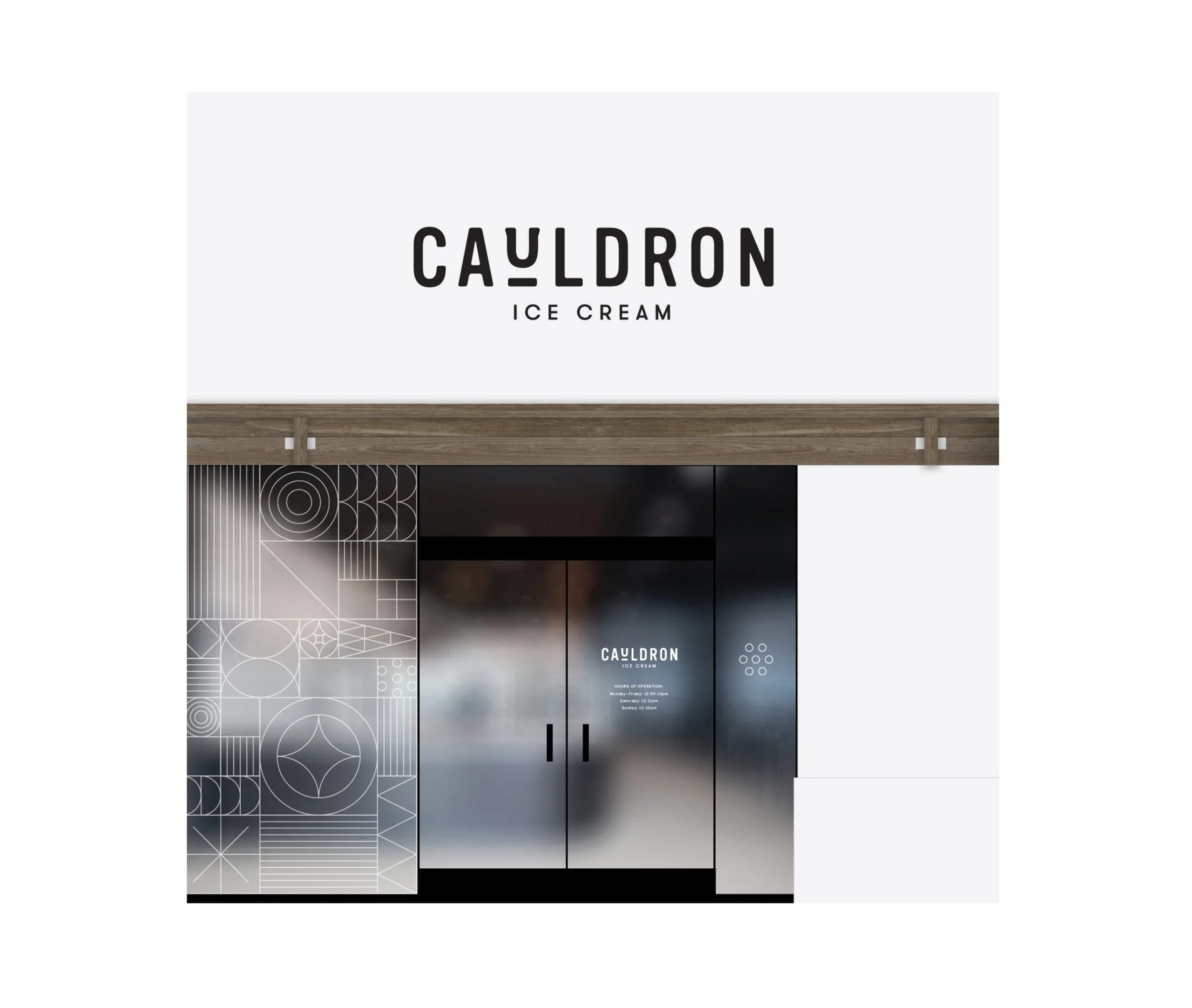
The goal was to build an identity that embodies Cauldron’s brand pillars: connection, satisfaction, and wonder. Our team explored how a balanced interplay between playful and refined could come to life. A neutral palette with pops of color, timeless iconography, and clean typography (with a nod to the “cauldron” where ice cream is freshly made) all came together to rebuild Cauldron’s image.


The goal was to build an identity that embodies Cauldron’s brand pillars: connection, satisfaction, and wonder. Our team explored how a balanced interplay between playful and refined could come to life. A neutral palette with pops of color, timeless iconography, and clean typography (with a nod to the “cauldron” where ice cream is freshly made) all came together to rebuild Cauldron’s image.