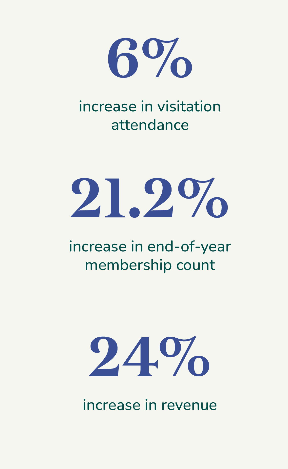
Filoli is a special destination that invites all to experience its lush gardens, historic house, and nature preserve. Its leadership selected our team to revitalize the Filoli brand as the nonprofit organization, originally built as a private residence in 1917, plans for a more inclusive future. Our challenge was to create a new identity and graphic system to engage greater, more diverse audiences while strengthening ties with loyal members. We needed to raise the level of their brand to the must-see destination that they are and aspire to be, and strengthen their move from a preservation mindset to a visitor-centric view with a wider lens of past, present, and future.
Client: Filoli
Role: Designer
Studio: Chen Design Associates
Development: Katherine Hoffman
Photography: Bernee Briones + Kenny Jong
Creative Services:
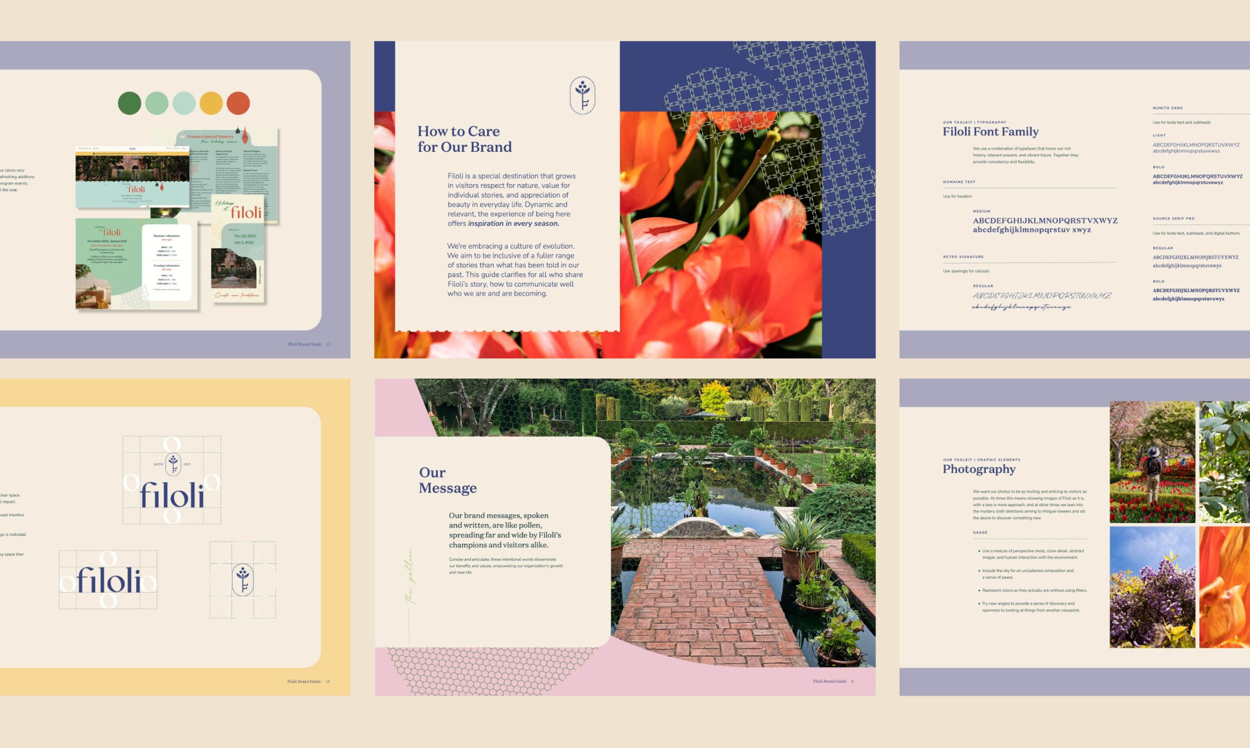
Brand Identity
Identity System Design
Brand Guidelines
Art Direction
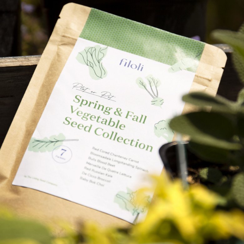
Packaging
Newsletter Template Design
Social Template Design
Messaging

During the ideation phase, our team came up with visual doorways that made way for exploring combinations of different possibilities and perspectives. Through our findings and research, the four doorways that stood out to us, we created visual moodboards for which opened up new avenues for potential solutions. It encouraged a more broader exploration of ideas beyond the obvious, which ultimately led us to a more innovative and well-defined ceoncept.

Old Logo
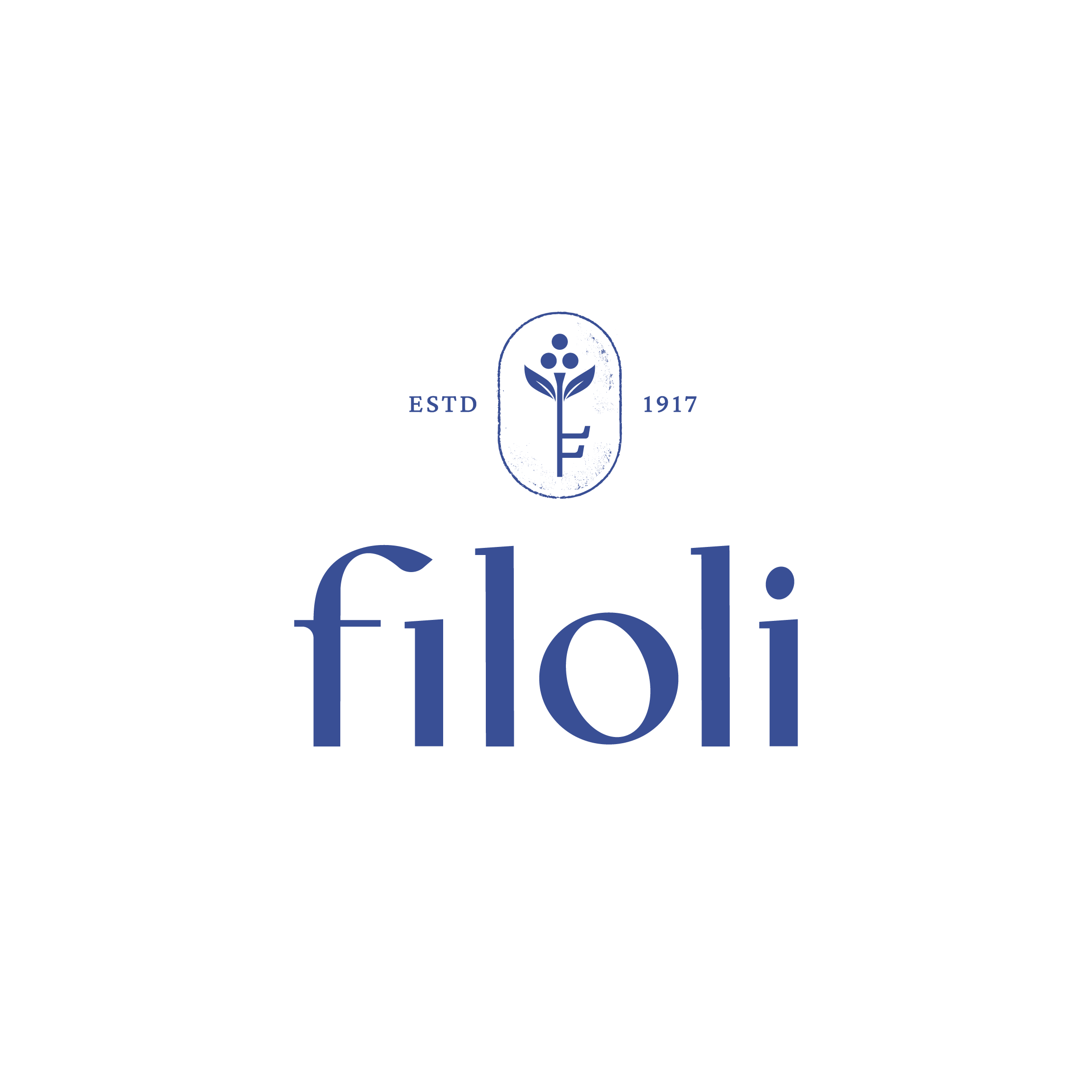
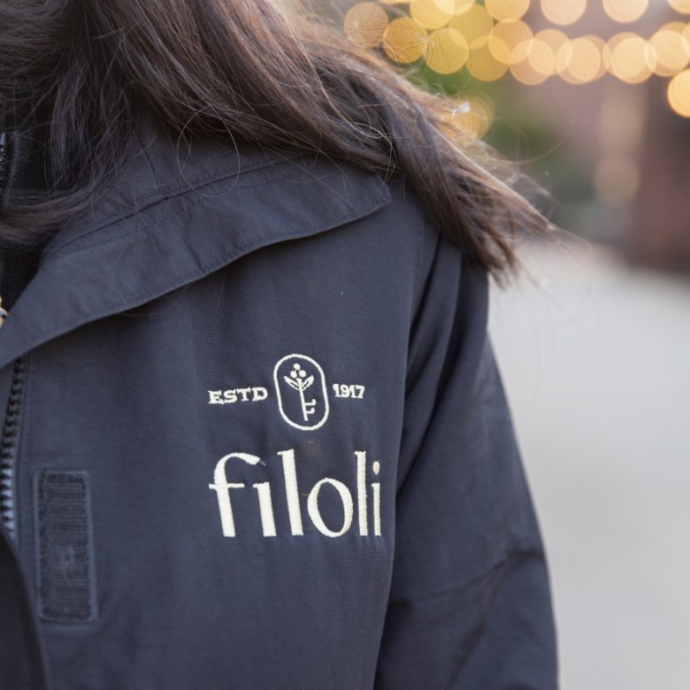
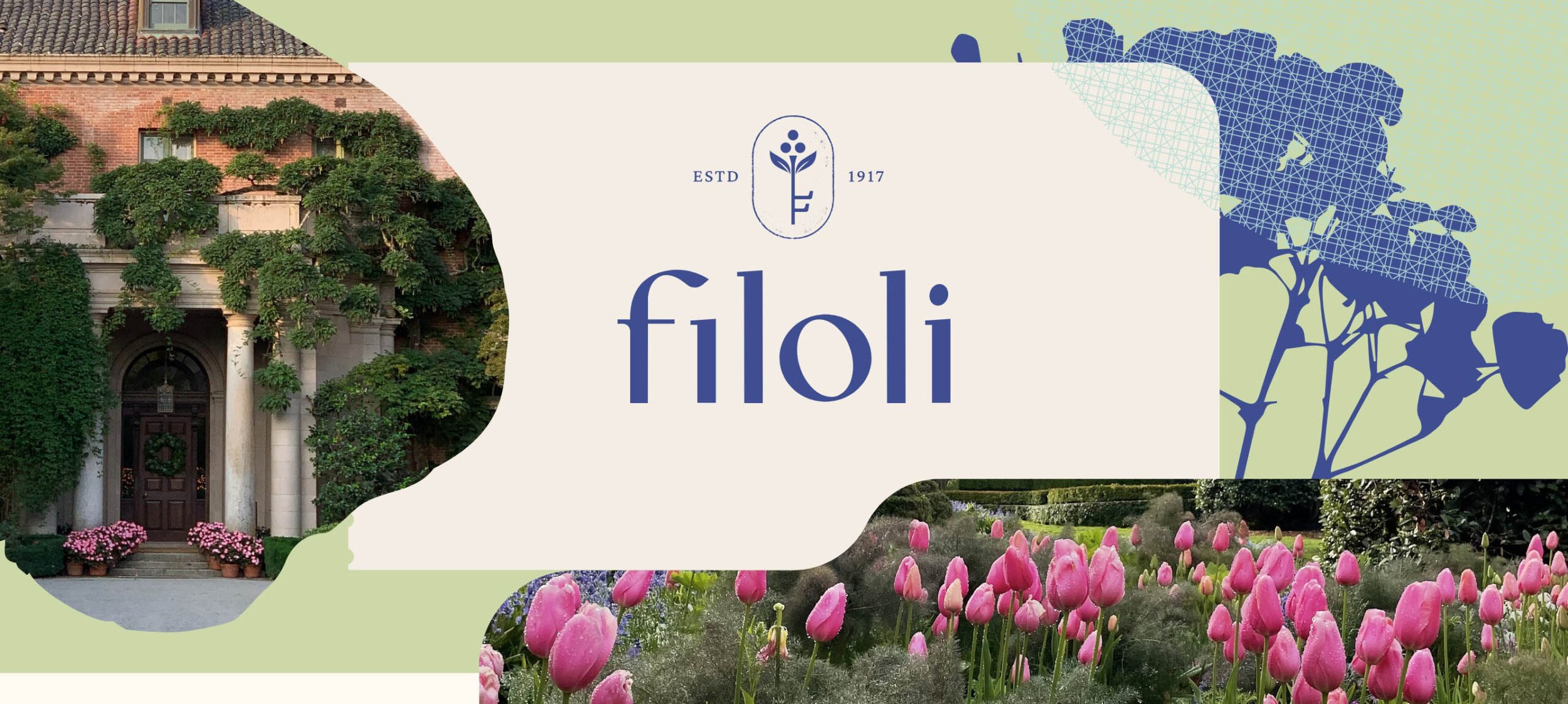
New Logo
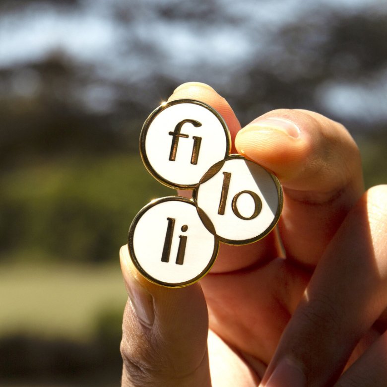
The Primary lockup shows the Filoli name in strong, clear focus, while the “stemkey” symbol invites curiosity. Timeless letterforms feel both classic and contemporary. The first two letters hint at an archway. The “o” evokes something unexpected. The “stemkey” is generative and symbolizes new growth: buds and leaves coming forth from the main “F” stem. Visually elegant, it contains the idea that a new thing is emerging from history, giving access to all that Filoli offers to everyone.